Method
How I design websites.
Find the best real examples, lock the rules, then cut until it stops looking AI-made.
The steps
- 01
Start from the brand
Real logo, photos and Instagram come first.
- 02
Study the best
Award-level sites, then proven free templates.
- 03
Lock the rules
One typeface, one accent, and a banned list.
- 04
Show options, keep one bold
Two or three heroes side by side, then pick.
- 05
Build in milestones
Section by section, so it stays consistent.
- 06
Cut words, add pictures
Every pass removes copy. Go Further Group lost 40–60%.
- 07
Judge it on a phone
That's where people see it first.
What I hold to
Not AI
No glowing gradients, code fonts or generated icons.
Inspired, never copied
Apple's clarity, Nike's conviction, Porsche's precision.
Minimal, with a pulse
Bold type and real motion where it matters.
The hero sells
Look great, give one clear next step.
Real photos
Real people and work. Never stock or generated.
Every section has a job
If it doesn't help someone act, it goes.
The process in action
Go Further Group, before and after
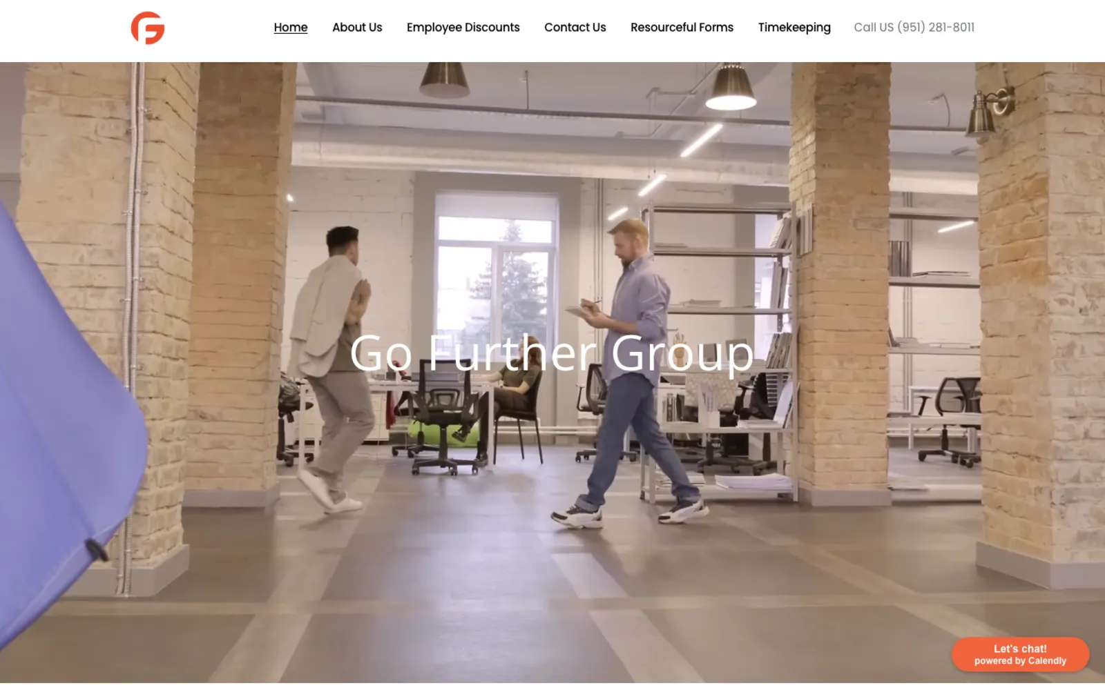
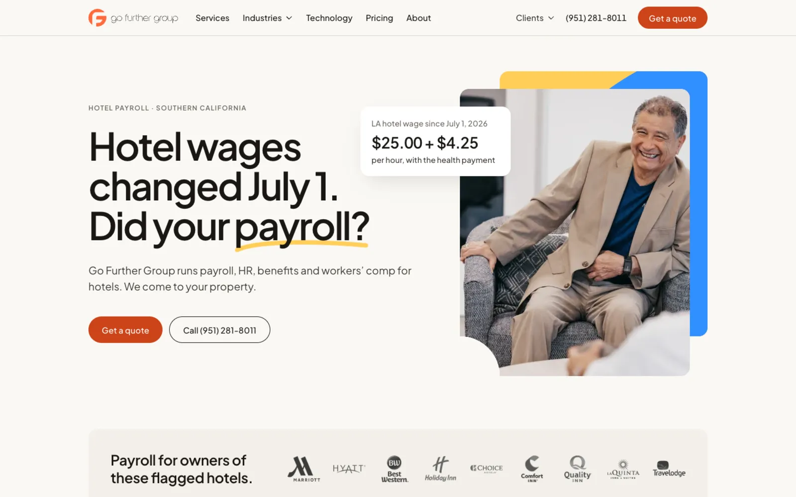
The old site was a stock theme scoring 57 on phone speed.
My first three looks got thrown out for looking too AI.
Back to the process, and it now scores 98–100.
Honestly, I still react before I research. The process kicks in after the first rejection.
Sites
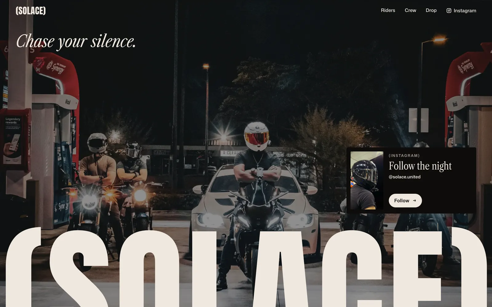
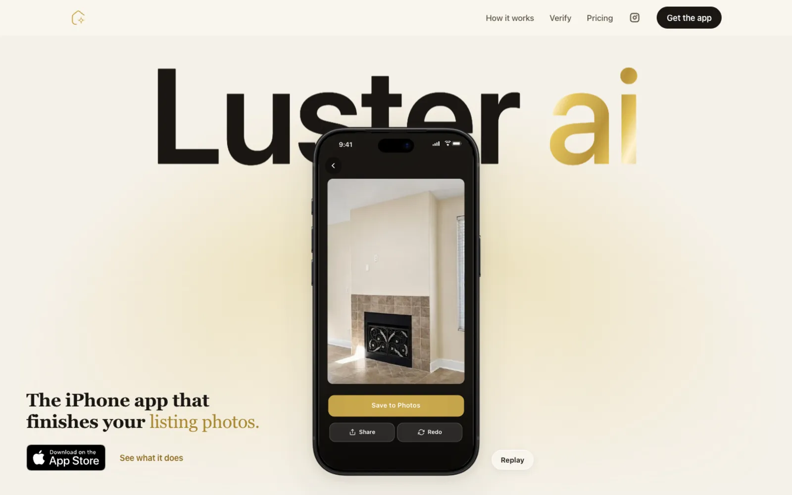
Need a website you're proud to hand someone? Let's look at what you have over coffee.